
PHOENIX PIZZA FEST
THE CLIENT
PHX FEST
THE BRIEF
Lisa and David of PHX FEST came to me to help revamp their annual pizza festival. The goal was to design a visually striking branding and engaging promotional material for the upcoming Phoenix Pizza Festival. The client seeks a design that incorporates bright colors, bold elements, and pop art-inspired visuals to effectively capture the essence and excitement of this local culinary event.
SERVICES
Creative Direction
Branding
Illustration
Print Design
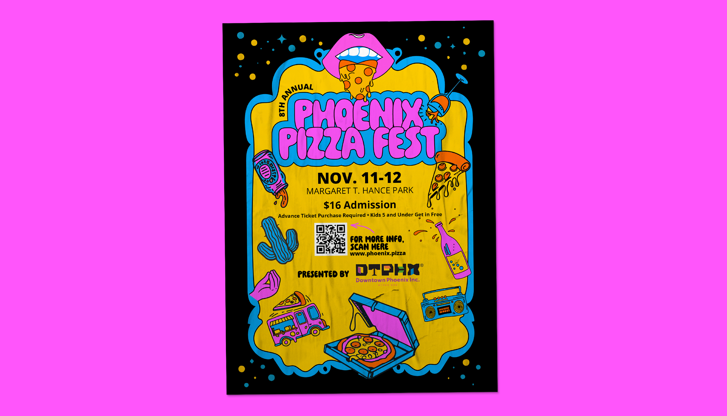
Colorful and Vivacious
The Phoenix Pizza Fest logo concept ingeniously merges the previous logo with modernity, capturing attention with its innovative approach. Lisa's directive to retain the essence of the original logo is manifested in the vibrant and illustrative style. The mouth, boasting a pizza slice tongue, serves as a whimsical nod to the festival's culinary focus. Bright colors electrify the design, infusing it with energy and excitement, while maintaining a contemporary flair.
The juxtaposition of classic imagery with a fresh interpretation lends the logo a timeless quality, resonating with both nostalgia and contemporary tastes. It not only pays homage to the festival's roots but also propels it into the future with its bold and lively aesthetic. Lisa's vision for a bright modern take on the logo ensures its relevance and allure, promising to captivate audiences and leave a lasting impression on attendees of the Phoenix Pizza Fest.


THE CONCLUSION
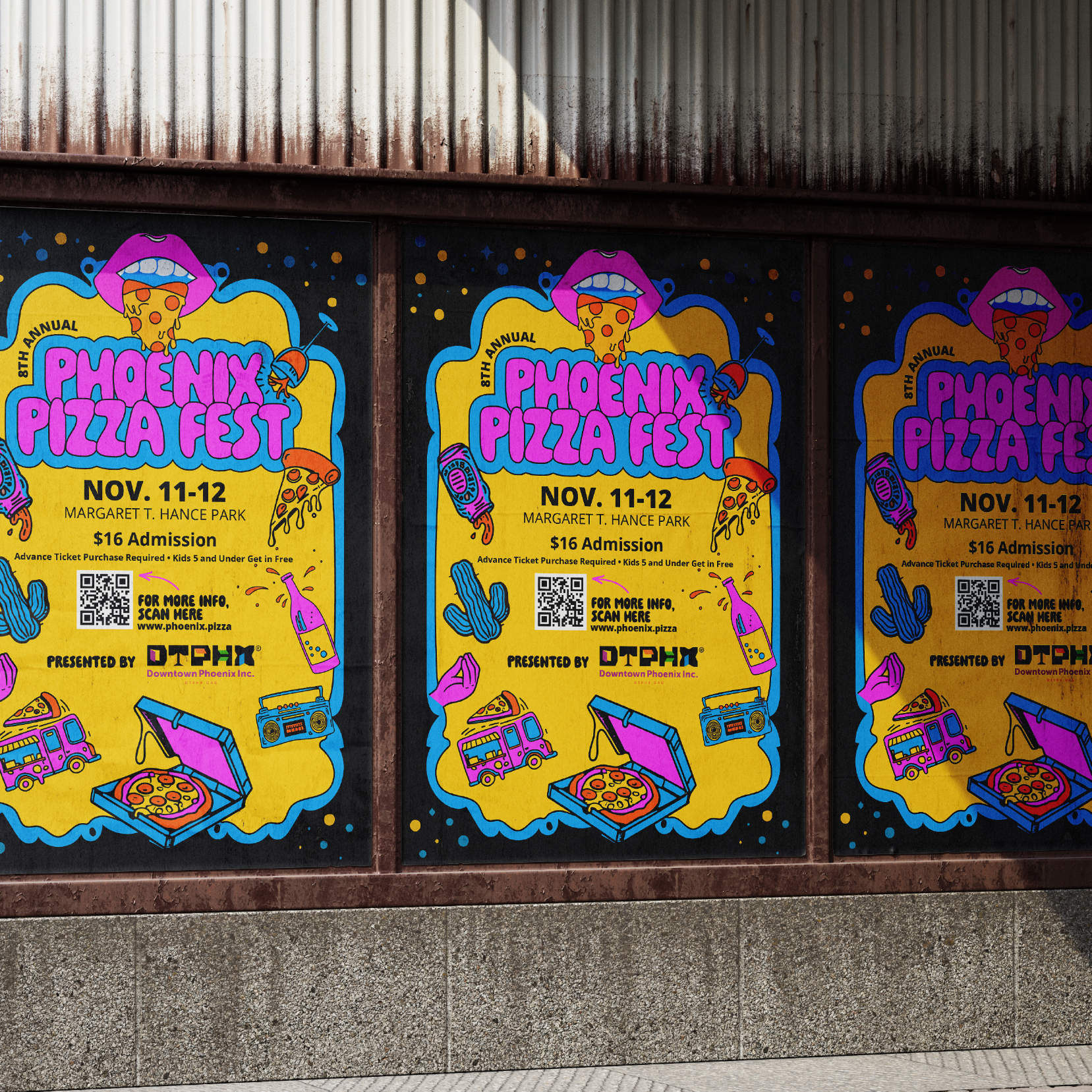
The Phoenix Pizza Fest project successfully merged tradition with innovation, crafting a visually captivating brand identity. Through vibrant colors, playful imagery, and a modern twist on the original logo, the festival's essence was brilliantly captured. This dynamic design promises to ignite excitement and draw crowds to the culinary celebration.