
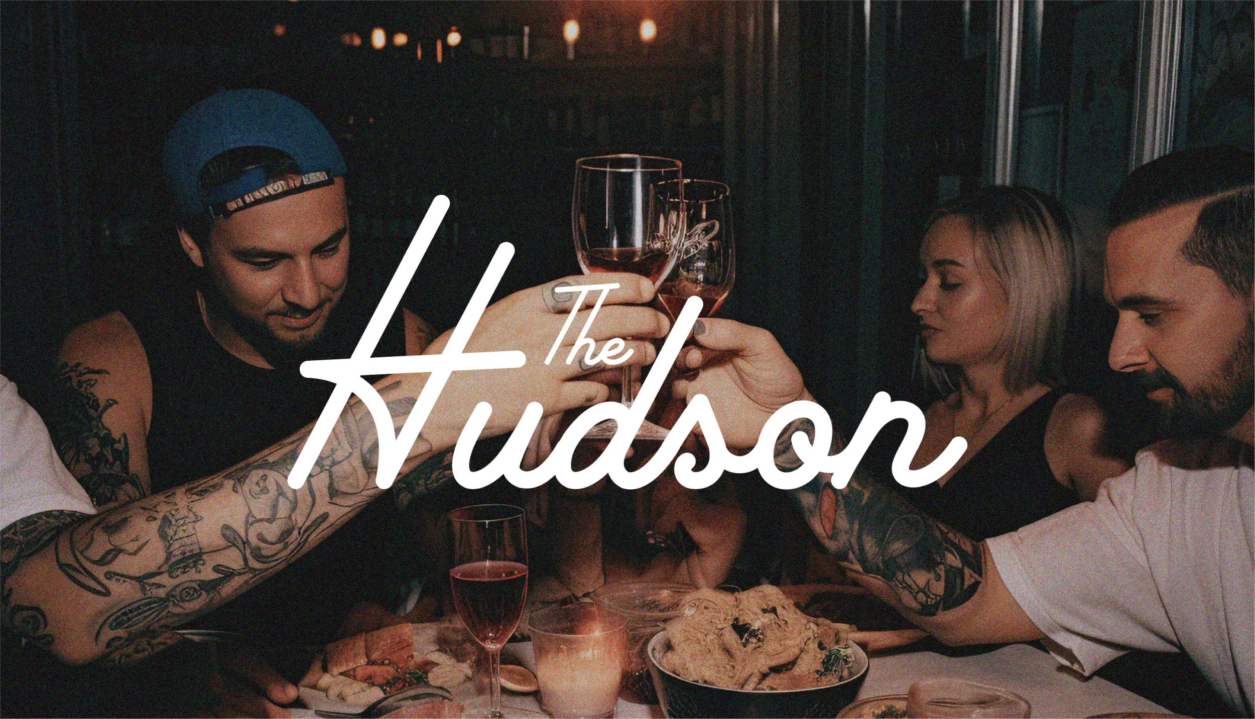
THE HUDSON
THE CLIENT
The Hudson Eatery & Bar
THE BRIEF
The owner reached out to me to develop a cohesive and authentic branding identity for The Hudson, a charming neighborhood restaurant located in Tempe. The goal was to create a visual identity that seamlessly integrates with the longstanding essence and character of the Hudson neighborhood, reflecting its unique charm and community-oriented atmosphere. The branding encompassed various elements, including the logo, color palette, typography, and visual assets, all aimed at establishing a strong and memorable brand presence that resonates with both residents and visitors alike.
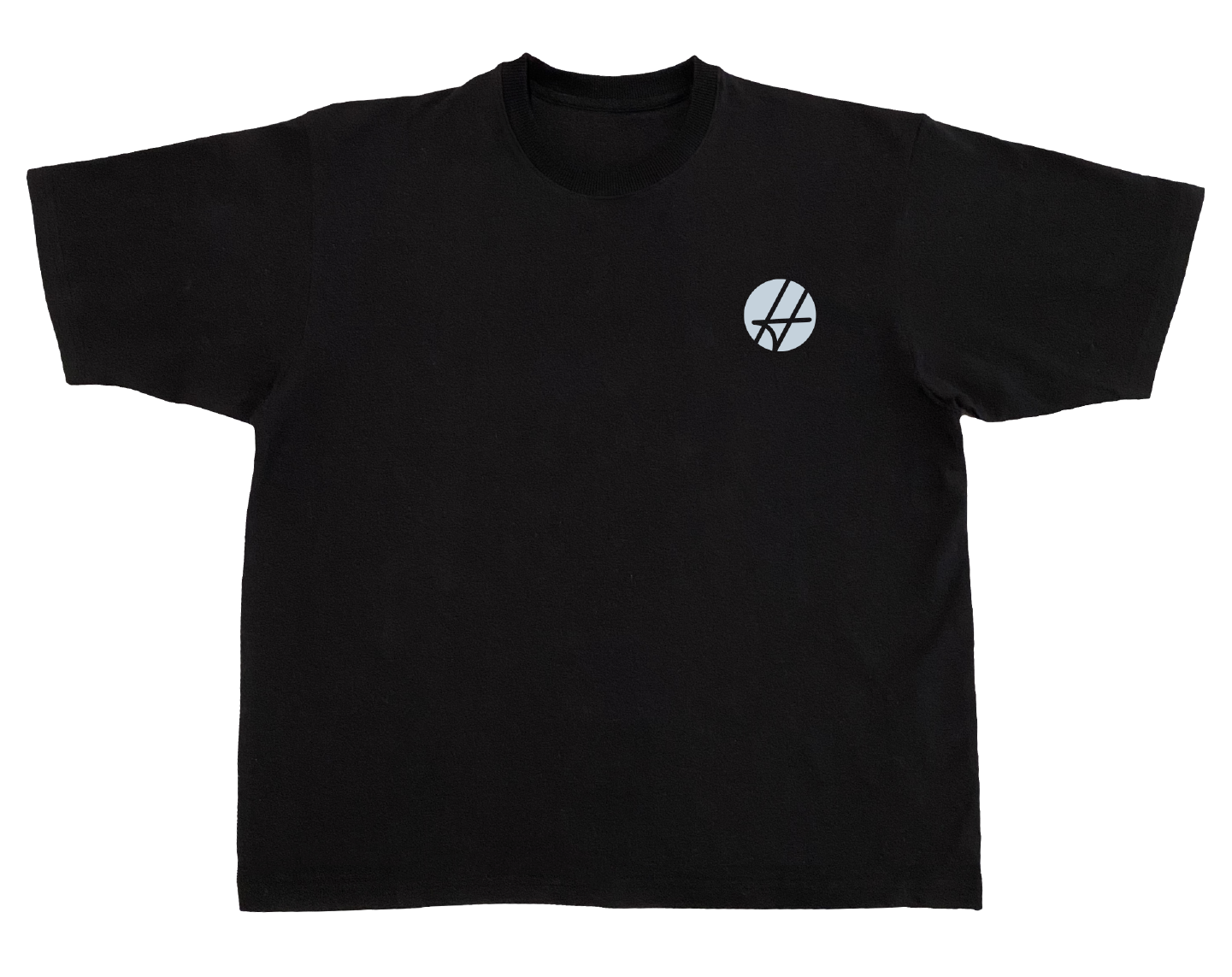
SERVICES
Creative direction
Brand identity
Marketing materials

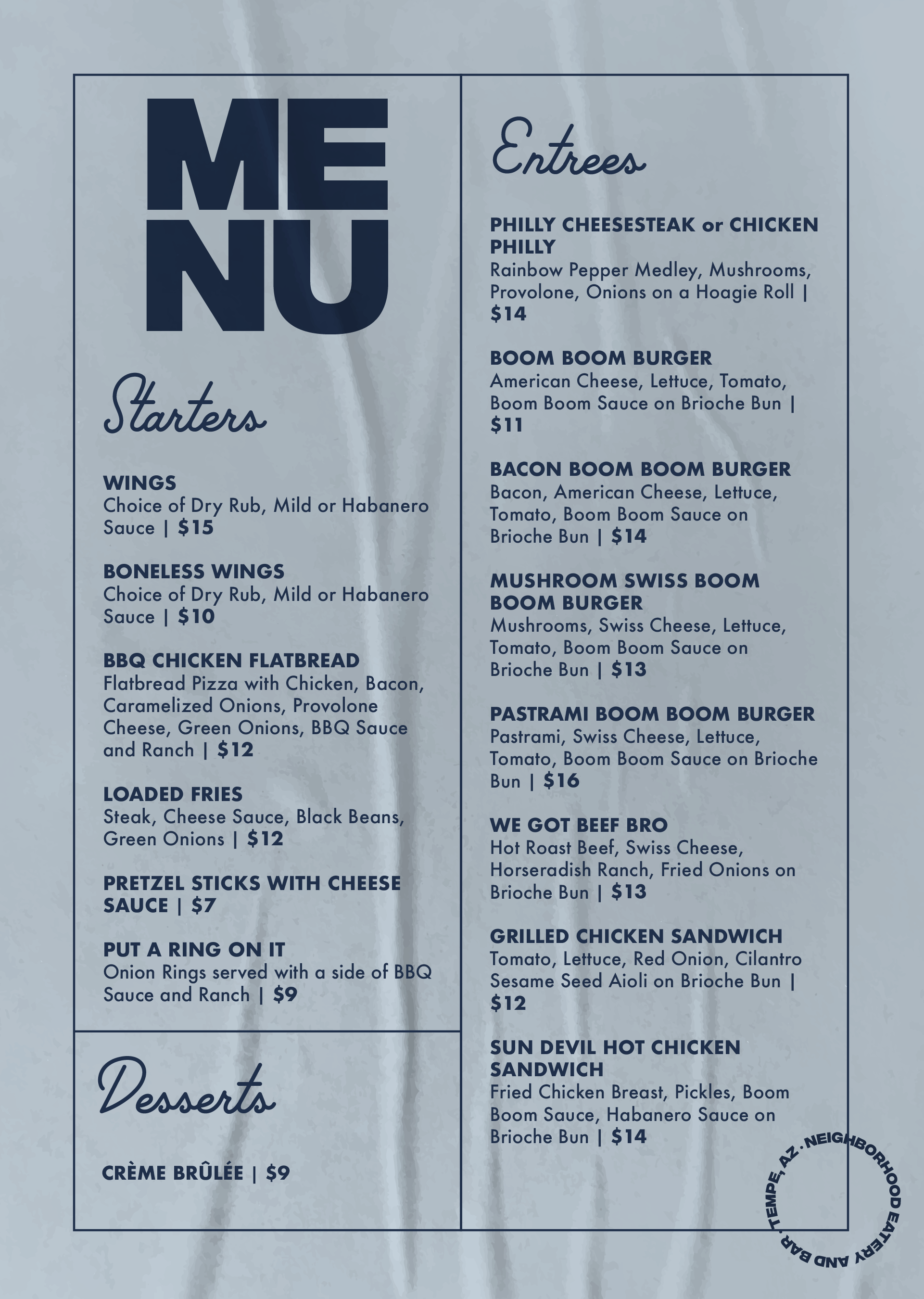
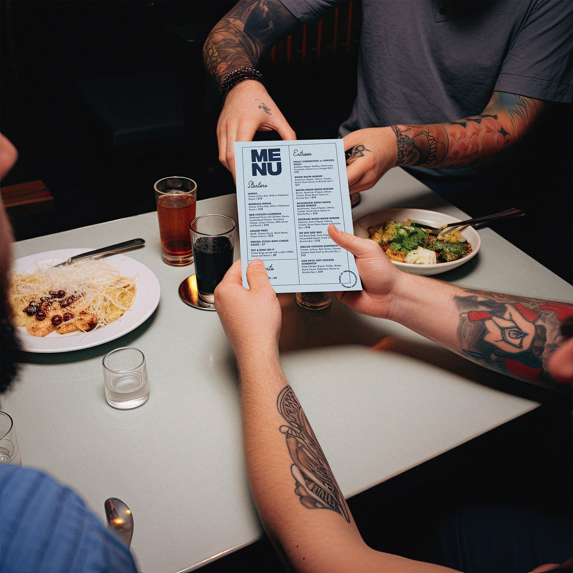
Nostalgic and modern.
The identity embraced a delightful blend of nostalgia and modern appeal, with retro fonts, cool colors, and a hand-drawn style of the iconic building. The typography, inspired by vintage signage, adds a touch of whimsy and character, evoking a sense of familiarity and warmth. The color palette, consisting of cool blues, creates a refreshing and inviting atmosphere, reminiscent of the surrounding Hudson neighborhood's natural beauty. With a hand-drawn style, the visual assets and illustrations reflect the restaurant's commitment to a personalized and welcoming experience, capturing the essence of a close-knit community.
These design elements come together harmoniously, creating a branding identity that effortlessly integrates with the long-standing charm and spirit of the Hudson neighborhood in Tempe, providing an engaging and memorable experience for patrons.


THE CONCLUSION
The branding for The Hudson has successfully achieved its objective by capturing the essence of the long-standing Hudson neighborhood in Tempe. Through thoughtful design choices, the branding establishes a strong and memorable presence, setting The Hudson apart as a welcoming and authentic neighborhood restaurant.